Grafana is a great piece of software for visualizing data and monitoring. It’s outstanding at what it does when paired with a time-series database like InfluxDB, except this time I’m trying to get it to work as a weather forecast dashboard, instead of any historical time-series data.
I choose CaiYun Weather (彩云天气) API for having previous experience with it, as well as its unlimited free tier. I must admit that I initially came up with this idea for having seen the presence of JSON API datasource plugin for Grafana, which reminds me of CaiYun’s JSON API being a perfect fit.
JSON API Datasource
Configuring the datasource seems easy at first, like just inserting the URL and configure HTTP headers as needed. Since CY’s API puts the API key in the URL path, there’s no headers to configure. So I can just put a single URL and save it.
https://api.caiyunapp.com/v2.5/TAkhjf8d1nlSlspN/121.6544,25.1552/hourly.json
I choose the hourly API so I can have forecast for the upcoming 48 hours.
So far this is a readily available datasource that I can query. But after reviewing the JSON query editor, I decided to chop off the last segments of the URL and leave just the part up to the API key:
https://api.caiyunapp.com/v2.5/TAkhjf8d1nlSlspN/
The point here is, the query editor allows specifying an extra Path, which appears to be concatenated with this URL in the datasource configuration. Notably, I can then put the coordinates in a variable, use it in the query, and build a single dashboard for many cities.
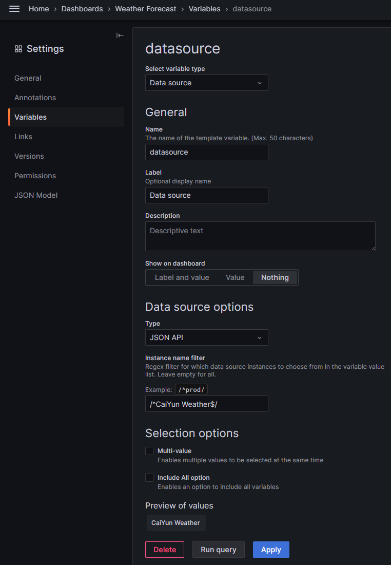
Dashboard variables
Now that I have the query format planned, I can add a dashboard variable for selecting cities.
First things first, since I’m going to use the same datasource for all panels, I first add a variable for the datasource and restrict it to “CaiYun Weather”:
Then I add a variable $location for the city name, and provide it with a list of cities I want to show. The variable type would be “Custom” since this is just a human-maintained list. There certainly are better ways like using a relational database or an external API, making it easier to update, but for now I’d like to keep it simple.
Beijing : 116.4074\,39.9042,Shanghai : 121.4691\,31.2243,Guangzhou : 113.2644\,23.1291,Shenzhen : 114.0596\,22.5429
Panels
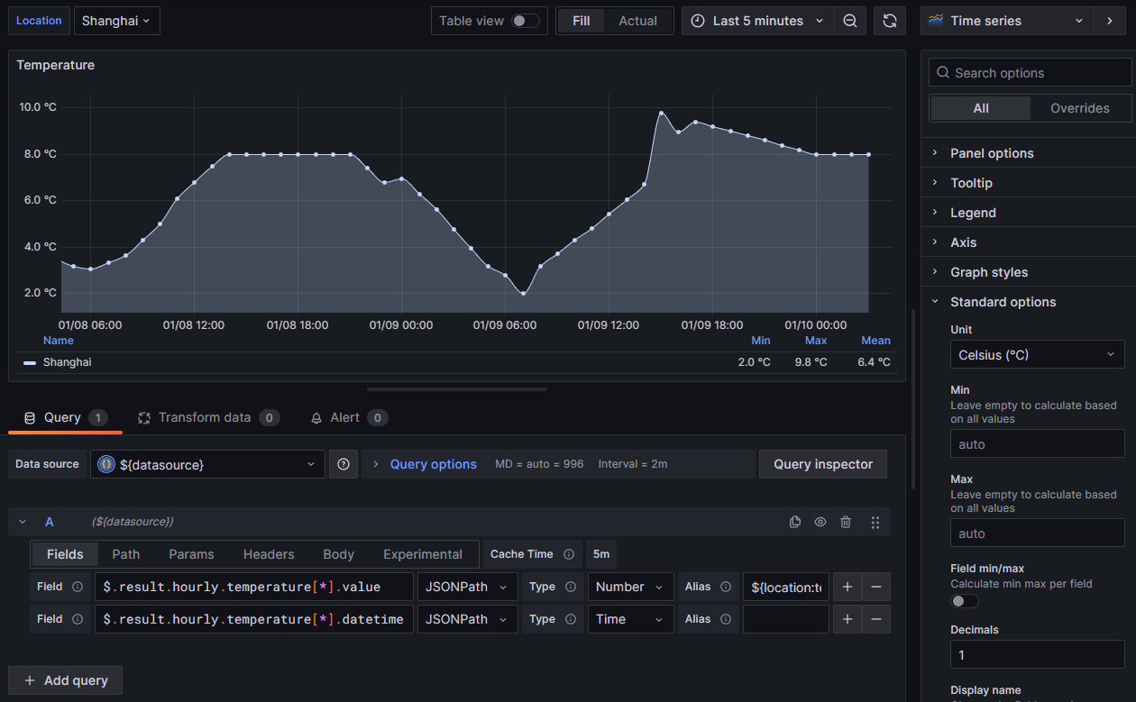
First and foremost, the most intuitive metric to show is temperature. I add a time series panel and configure it to graph the temperature. Start by building the query:
- Datasource: Select
${datasource} - Query A:
- Path:
/${location}/hourly.json - Fields:
- JSONPath:
$.result.hourly.temperature[*].value, Type:Number, Alias:${location:text} - JSONPath:
$.result.hourly.temperature[*].datetime, Type:Time
- JSONPath:
- Path:
I stumbled on getting the time series to display correctly. It wasn’t anywhere obvious in the documentation for the JSON API plugin, but a series with Type = Time is required. Fortunately, CY’s API returns the time in ISO 8601 format in the datetime field, so I can feed it directly to Grafana.
So far so good, except Grafana shows “No data”. I realized Grafana is trying to show past data, but apparently a weather forecast provides future data. I need to change the time range to “now” and “now + 48h”. Ideally, this time range is fixed and not affected by the time range selector, since after all it’s limited by the API.
This is another place where I spent half an hour on Google. The answer is “Relative time” in “Query options”. Its format, however, is again unintuitive. While community posts shows 1d for “last 1 day” and the official docs gives several examples on using now, none of them told me how to indicate “next 48 hours”. The answer is just +48h or +2d. Notably, entering now+48h would result in an error.
To make the graph look nicer, I set the unit to “°C”, limit decimals to 1, and set the Y-axis range to 0-40, and add a series of thresholds with colors to indicate the temperature range. Also worth mentioning is to make the graph change its color according to the temperature, so I set “Graph style → Gradient mode” to “Scheme” and “Standard options → Color scheme” to “From thresholds (by value)”.
Now this panel looks stunning.
More panels
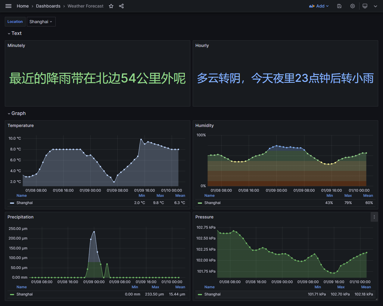
CY’s API offers a variety of weather data, so with little effort I can add more panels for humidity, precipitation and more, by duplicating the temperature panel and changing the query. I also need to change the unit and thresholds accordingly but that goes without saying.
There’s also a small piece worth displaying: A description text. It’s easy to put it in a “Stat” panel and display as “String” (instead of “Number”). And better yet, CY provides two descriptions: One for the next two hours, and one for the next two days. Two panels for two pieces of text, yeah.
One last thing I decided to leave out for now: The skycon field that describes the weather condition, like “CLEAR_DAY” or “RAIN”. It’d be comparably easy to add a panel for it, using “Value mapping” to change the text to something more human-readable, but I’m not at the high mood for it right now, so maybe I’ll pick it up later.
Results
Now I have a nice dashboard for viewing weather forecast for multiple cities:
If you’d like to try it yourself, I’ve published the dashboard on Grafana.com: Weather Forecast. Just add the same datasource with your API key, and you can import my dashboard and start getting weather forecast for yourself.


Leave a comment